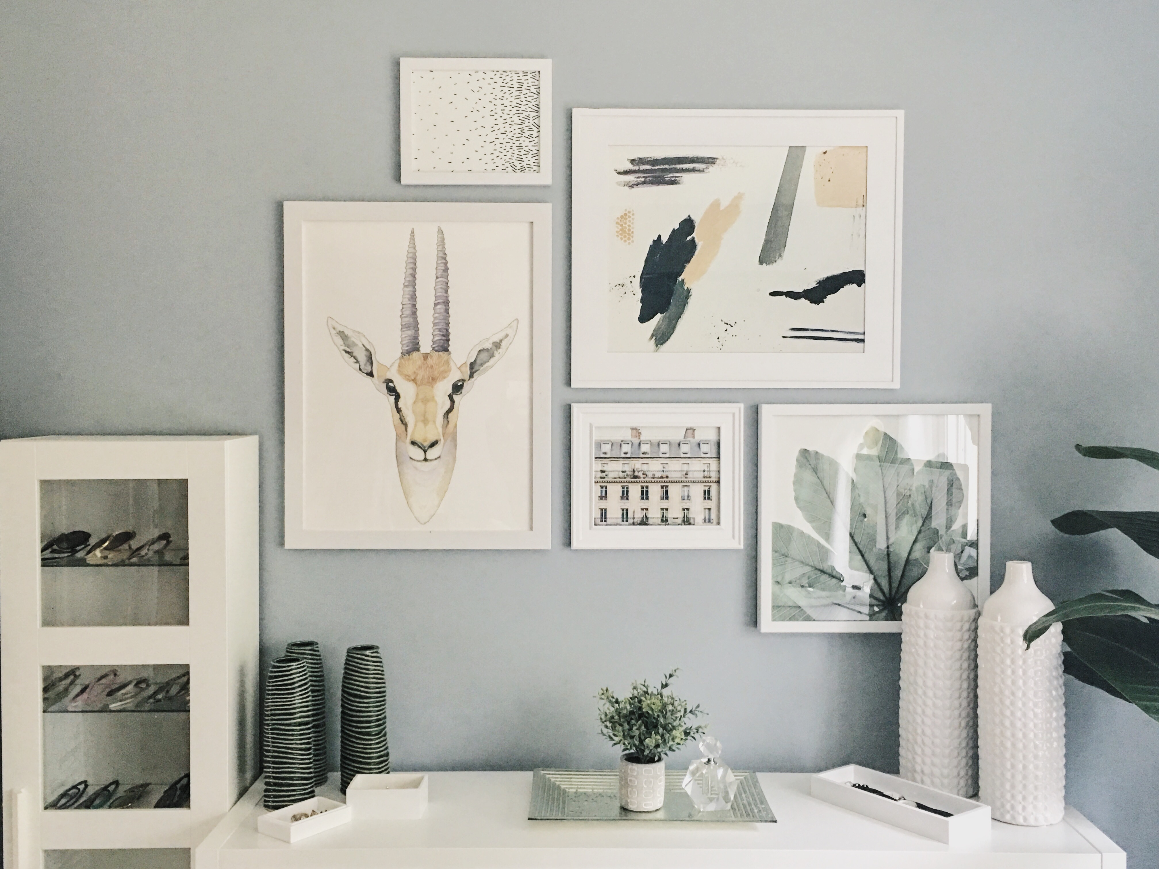
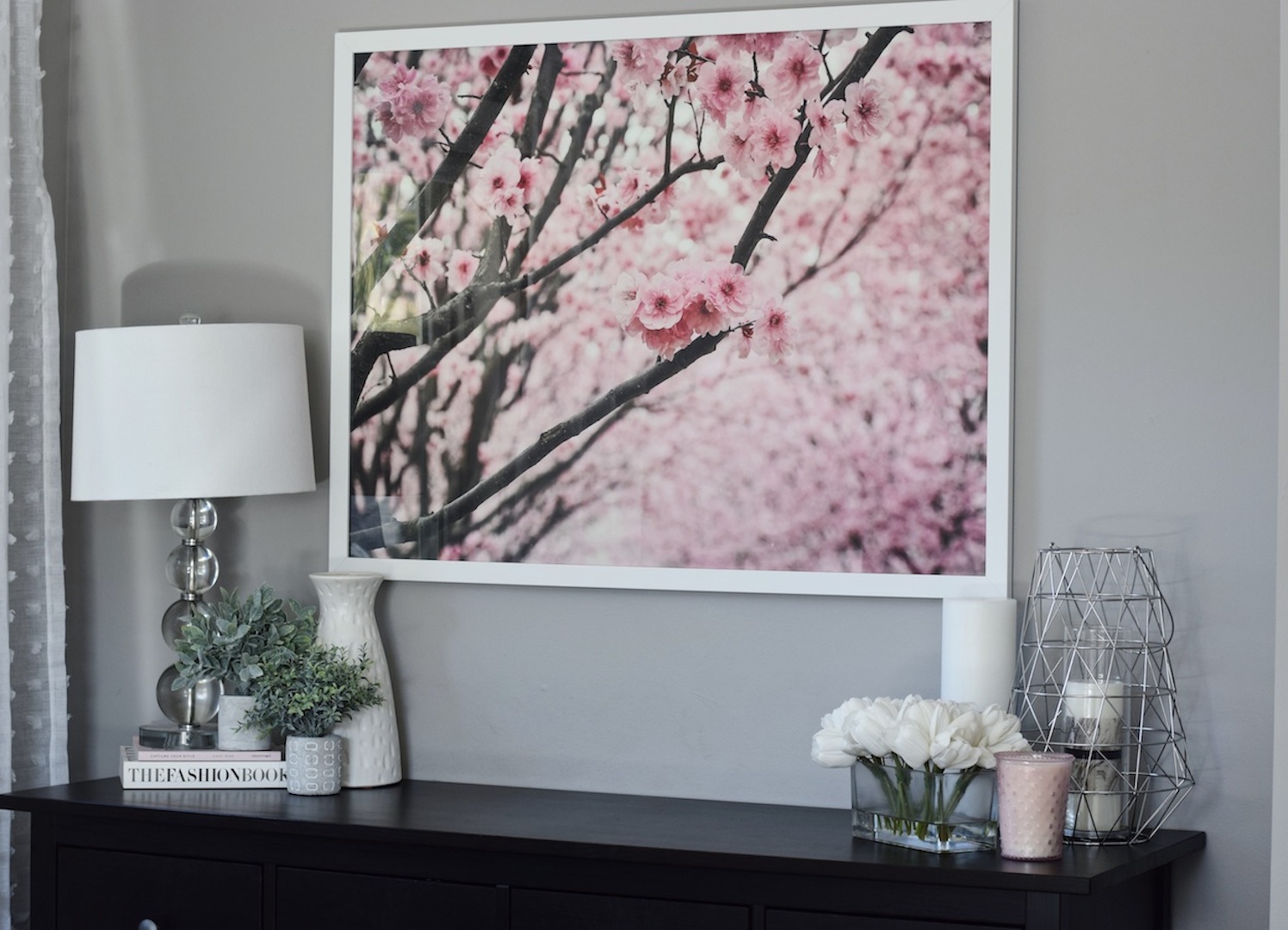
I have been dreaming about designing my own office space since I became very serious about blogging. I needed a space to call my own, inspire me and be true to my aesthetic. A gallery wall seemed like the perfect design element to elevate the space. The trick to a gallery wall is to keep the prints interesting and unique, fun and cohesive. There are a few steps to keep in mind while designing a gallery wall.
CHOOSE A COLOR SCHEME
When designing a space, you want to choose a color scheme first. This is the easiest way to stay focused on pieces that bring the room together. I wanted an all white office, with all white furniture. This set my room up as a perfect blank canvas. I wanted my colors to be warm and inviting and not distract me from feeling inspired to work in this space. I chose to go with a neutral palette of beige and green.
CHOOSE YOUR PRINTS
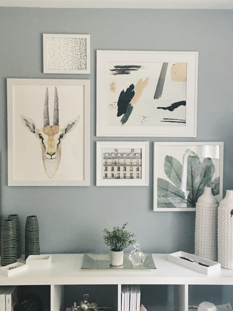
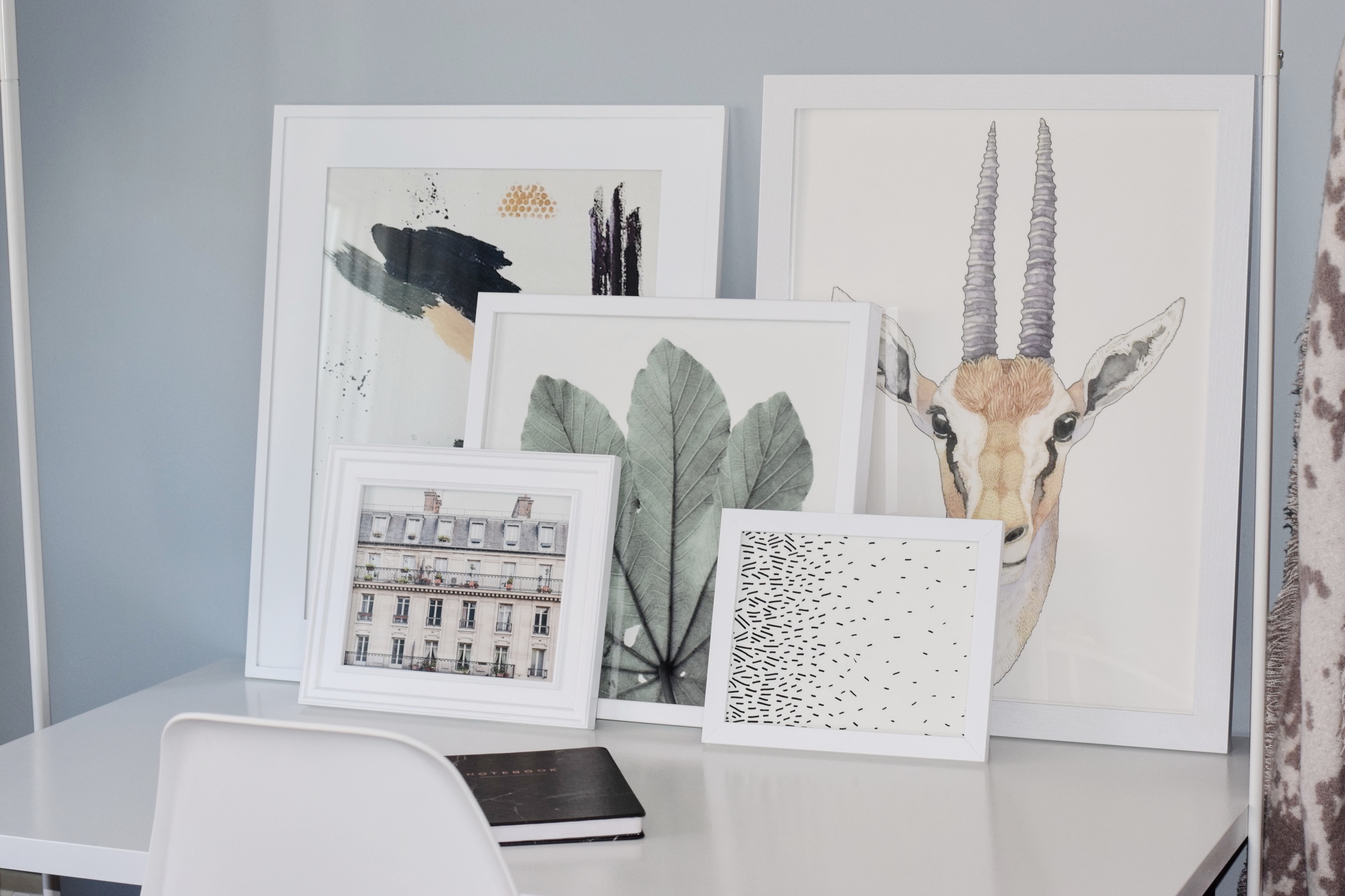
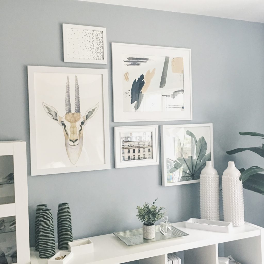
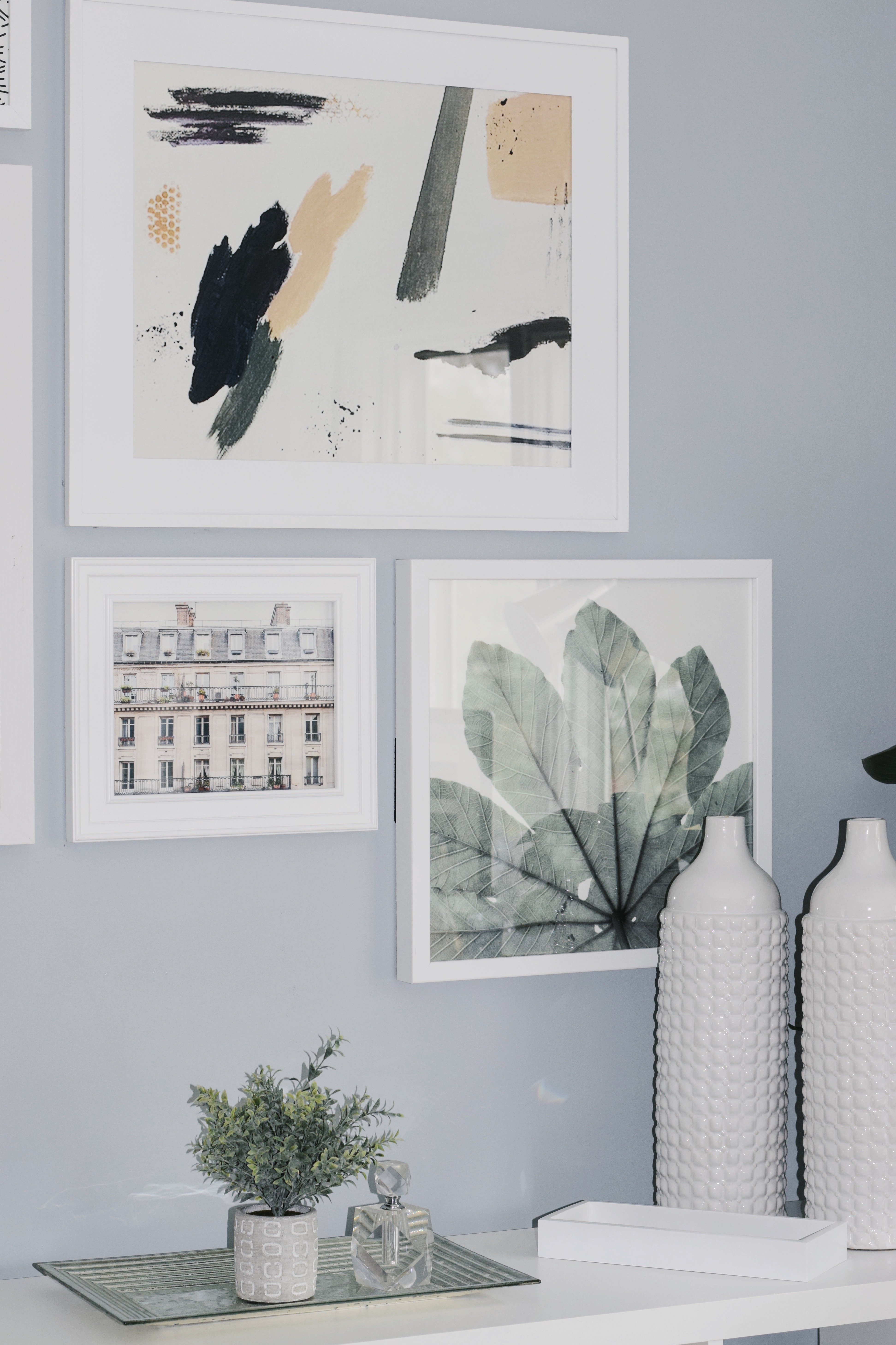
The magic happens of finding your prints after you choose a color scheme. I came across this african gazelle print first and fell in love with it. It was an interesting print that caught my eye and served as the primary photo for me to build my gallery wall. The beige coloring of this building in Paris paired nicely with the first print, while giving me a touch of green to work with. Using the pop of green to incorporate more color into my gallery wall, I found this clean looking leaf print. I wanted to tie all three of these prints together, so I searched for an abstract print that incorporated the beige and green. This print had black and white as well so I chose a simple print of falling stitches to round out the assortment.
CHOOSE YOUR FRAMES
There was no method to my madness when selecting what size prints to order. I stuck with the mentality bigger is better and I would figure it out when the time came. I suggest you not follow this mentality. 4 of the 5 prints I ordered were stock sizes so frames were fairly easy to find. The leaf print was 16×16 meaning I needed to custom order the frame. Minted sells frames with the prints that you can view before you order. I will be using this option the next time I order to make the entire process more seamless and time efficient. I stuck to my white color story and framed all my prints with thin white frames.
LAY IT OUT
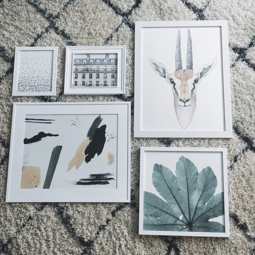
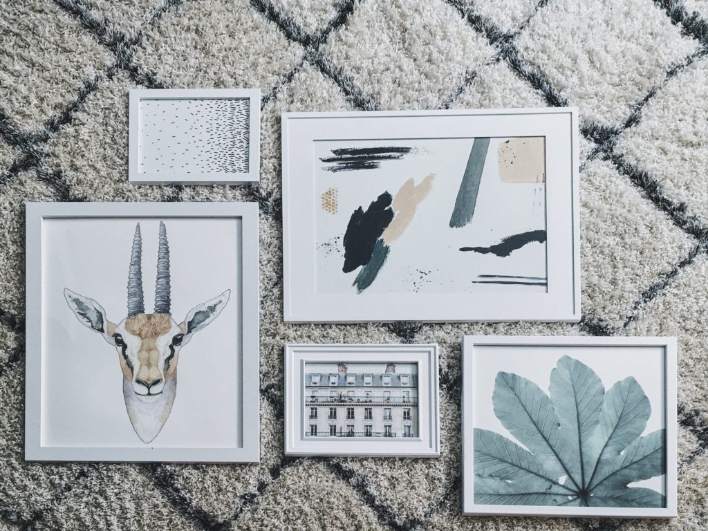
I suggest laying all of your framed prints on a big open floor. This allows you to easily move the prints around depending on how you want it to look. Take a picture each time you switch the prints so you can go back and reference. This was the hardest part for me and it took me a couple days of staring at them on the floor to finally decided how I wanted the wall to look.
HANG IT UP
And then it was time to hang your gallery wall. Hanging the largest print first is key, to make sure you have enough space and work outwards hanging the rest. Do this step with a friend to help hang and offer advice from a distance to ensure the prints are straight and spaced perfectly. Then you can sit back and admire your gorgeous gallery wall!
SHOP THE PRINTS
In collaboration with Minted. All opinions are my own!

